Are you struggling to fit your website accurately on all screens? This blog is for you. You will know about responsive web design, its uses, and effective tips to make responsive design easy. You will find clear steps to build a responsive website and stand out from the crowd every time.
Designing websites that look good and fits all type of screens is mandatory to stand out in this trend. Previous studies state people spend most of their time on small devices. It is found that 54.85% of web traffic is generated from mobile phones. It is establishing a strategic roadmap for the necessity of mobile device optimization.
However, it sometimes creates trouble fitting in mobile device screens in many cases conflicts with several issues. That’s where responsive design enters and shows the capacity to construct a single website that can adjust on all screens.
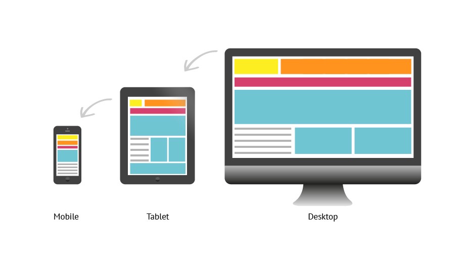
Responsive Website Design And Its Types
Responsive design is a technique that allows webpages to fit in all sizes of screens in which they are viewed. This means the pages will work on screens, function correctly, and scroll vertically on all devices.
The importance of responsive design is increasing with time as the use of the internet through mobile is rising. Statistics say over 50% of website traffic uses mobile devices for browsing. It may take extra time to make a website accommodate all screens but this gives a great user experience. This ensures the proper use of the site and holds back clients to boost business.
Types Of Responsive Web Designs
Responsive web design is a technology that allows web pages to dynamically scale and adapt to various devices.
There are different types of responsive design, so let us know in detail.
1. Fluid Responsive Web Design:
A website’s style and content remain the same regardless of the device being used when it has a fluid responsive web design. The websites will adjust to the browser’s width automatically. So users from distinct devices like iPhone and Android will experience the same website flawlessly.
2. Adaptive Responsive Web Design:
The meaning is almost there in the title. Adaptive responsive design means Adapting in size according to the place. Media queries are used in adaptive, responsive web design. This specifies which website components should be scaled down or increased depending on screen size.
For instance, media queries can retain a part of your website that is intended for large displays (like the homepage) at its original size. While viewing on smaller screens enlarges it when viewed on larger screens. Similarly, media queries may be used to adjust all of the information on your website. This will suit the screen of small devices without impacting any other areas of the page.
3. Static Responsive Web Design:
Media queries are not used in static responsive web design. Instead, it relies on the website’s layout to automatically resize. As a consequence, regardless of screen size, your website will seem the same on every device.
There are also hybrid designs that combine elements of both fluid and adaptive Responsive Web Designs.
Six Effective Tips To Make a Responsive Website
Website’s responsiveness improves usability and readability on smartphones and small devices. A responsive website may adjust to the numerous devices via which customers visit it. Taking into account the growing number of people using smartphones and tablets to visit websites. Responsiveness must be at the heart of web design strategy in 2023.
A guideline to a simple list of procedures you may use to achieve user satisfaction on their preferred device.
Set Appropriate Responsive Breakpoints
A breakpoint in responsive design is the “point” at which a website’s content and design will adjust in a certain way to deliver the greatest possible user experience.
Every website is viewed through a range of devices with varying screen sizes and resolutions. The app must render flawlessly across all screen sizes. Images and content cannot be altered, cut out, or hidden.
To allow this, developers have to use responsive breakpoints, sometimes called CSS breakpoints. These are points defined in the code. Website content responds to these points and adjusts itself to the screen size to display an accurate layout.
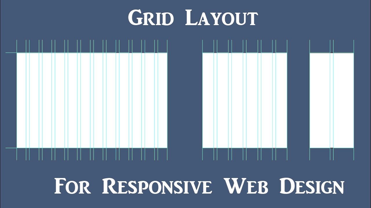
Make Site Responsive Using Grid System
As you all know, generally the screen sizes of different devices varies. This means elements of your site will fit accurately on different screens. However, if it does not fit accurately this will give a bad experience and lead to loss of clients.
The adoption of a grid system is one of the most significant things you can do when developing a responsive website. This allows you to effortlessly rearrange your content for different screen widths. Using a grid structure ensures that your content is always easy to read and navigate.
Another wonderful technique for developing a responsive UI is to employ responsive pictures. This ensures that your photos will change to the size of the screen on which they are being seen. This is an excellent method for ensuring that your website appears amazing on all devices.
Make Your CTAs Pop & Use Media Queries
You have a call-to-action on your website that you want prospective consumers to perform. A major call-to-action must be present on the losing, websites if you want to provide visitors with the best chance to take action.
Accommodating the site on different screens accurately will give a better experience and hold back the users. Using media queries is one of the best ways to implement. Media queries allow you to modify the CSS of your website dependent on the device being used via it. This means you may have distinct looks for your desktop, tablet, and mobile devices.

Ensuring A Fast Loading Site
When it comes to waiting for websites to load, today’s users are not exactly patient. Attention spans are short. Most visitors will abandon your site if it does in a few seconds. The impacts of a slow site are
1. You lose a potential customer
2. Your website gets negatively noticed on Google Rankings.
Compatible sites are often faster to load than mobile-targeted designs. Concepts like “performance budgets,” which include compression and adaptive images, can be used to improve responsive web designs even further.
Apply design patterns & Aim for accessibility
Responsive design patterns are split into five categories: largely fluid, column drop, layout shifter, small adjustments, and off-canvas. These patterns assist determine when columns or blocks go from multi-column to single-column mode. The order of the items as they vary, and if elements become “hidden” in off-screen choices until a user reveals them.
The four online accessibility principles are apparent, executable, durable, and explanatory in an accessible web design. Mobile accessibility should contain focusable active components and enough contrast (ratio 4.5:1 for regular text or 3:1 for large text). alternative navigation methods, and features that do not depend on color contrast to show function.
Keep Simple And Follow Guidelines To Create a Website Looks Great In All Devices
It is essential to keep your website neat and free from unnecessary decorations and animations. This will enable the site to give its visitors a seamless and smooth experience irrespective of the device they are using.
Consider these mutual benefits rather than a function-oriented compromise you’re compelled to make. A well-executed minimalistic design will make your website appear particularly appealing to a modern audience.
The use of flexible layouts, media queries, and viewport meta tags are among the essential criteria. You can develop an adaptable website that looks amazing on all platforms, from mobile phones to desktop PCs, by following these principles.
Why Is Responsive Web Design A Critical Business Requirement?
Designing a website and keeping it responsive is an important part to convert clients. So let us discuss the reason for its importance in your business.
Enhanced user experience (UX) improves the brand image:
It is critical to ensure that the websites are easy to navigate. It improves the entire user experience, which benefits the respective firms’ brand image. Responsive designs do not create issues while scrolling or zooming. Users may easily navigate the website and do relevant searches. They will have the same benefits as PC users while accessing from their mobile phones. It provides a better user experience for the visitors. Automatically it keeps your website engaged.
Promote social media marketing
Brands from various industries are turning to social media marketing. In these circumstances, they expect a sophisticated presentation to their clients. So, if you want to run a balanced social media strategy, you’ll need a flexible website.
It is easy to include all of the design ideas that go into creating a webpage. According to a trustworthy figure, approximately 80% of social media users access the internet using mobile devices.
Cost-effective and easy to maintain
It might get a bit pricey to build a site just for mobile visitors. Additionally, you must give its maintenance special consideration. It means you need to give time to updating and refreshing both your desktop and mobile websites.
Making changes won’t be even easier or quicker. Besides, you may even have to hire another designer to handle both website versions.
Key Takeaways On Responsive Design
Responsive design ensures you accommodate your site automatically on the device that you are browsing from. So let us overview the article and know what we could take from this blog. The takeaways are listed below.
- Optimizing your users’ browsing experience
- Reducing your bounce rate
- Ranking higher in search engines
- Reducing your maintenance requirements
- Consistent user experience across multiple screen sizes and devices
A responsive web design will assist you in lowering your bounce rate on mobile and other handheld devices. If a website does not load properly, mobile users will leave quickly and will not return. Therefore these key points will help you to take away helpful ideas and work them out practically.
Final Verses
You must now be fully aware of the specific reasons why your company requires responsive design today more than ever. Aside from that, we’ve highlighted several key aspects to consider while designing a responsive website.
If you are using WordPress, making your website design responsive might be simple with the use of plugins for a basic website. However, if you have a custom-coded website design, we recommend that you seek the assistance of expert web developers.
Making a site responsive is a compulsory task while designing one. This will multiply your user experience rapidly. You can reach a limitless audience and upgrade your business. So let’s focus on making sites responsive and let us know your queries to get instant support.

